In order to create a magazine that will appeal to a specific target audience i had to collect results from a wide range of people in order to see what is the most popular and how it would sell. I used the US reader profile of the Rolling Stone as a style model. They appeared to appeal more to 18-24 year olds due to the content, mainly adults without children and mainly male. This is the opposite of my target audience as i would like to appeal to a 16-18 year old male and females.
I am a 16 year old Heworth Grange media student and this is a blog about my studies.
Thursday, 24 October 2013
Monday, 21 October 2013
My Questionnaire
Here is a copy of a questionnaire that I distributed to 50 students. I chose to ask 10 people from different year groups and from different social groups to answer my questionnaires. I chose 25 boys and 25 girls, 5 from each group.
What is your gender?
Male Female
What is your age?
-10 11-15 16-18 18-21 21+
What is your favourite style of music?
Rock Pop Indie Classical Folk Hip-hop Rap Grime Electronic Jazz Pop-rock Other____________________
What do you usually listen to music on?
iPod Laptop Phone TV Internet CD
Other
How often do you buy music magazines?
Never Once a week More than once a week Once a month More than once a month
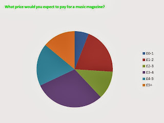
What price would you expect to pay for a music magazine?
£0-1 £1-2 £2-3 £3-4 £4-5 £5+
What type of music magazines are you interested in?
Rock Pop Indie Classical Folk Hip-hop Rap Grime Electronic Jazz Pop-rock Other
What do you buy a magazine for?
Articles Artists Freebies Music downloads Genre Other____________________
What would you want included in a magazine?
Articles Artists Freebies Music downloads Genre Other____________________
What colours attract you most to a magazine?
Red White Black Green Yellow Pink Purple Blue Brown Orange Other____________________
Friday, 18 October 2013
Thursday, 3 October 2013
Before starting my magazine, me and Rebecca went around the school to take several photos. I took photos of classes, the building and the surrounding area. I chose blue and yellow as my theme as it is the same colour as the logo. I used a photo of Rebecca in front of the school entrance on my front cover to show my main headline, I thought the photo was relevant. I used other subtitles to show other stories within the magazine than might be of more interest to students. I have seen this theme throughout other magazines and it looks most appropriate.
I chose to use the same person on the contents as I did for the cover so there is a theme. I stuck to the same colour scheme and used a relevant photo. I made it a simple layout so it was easy to read for the younger years and I decided against adding extra photos so it wouldn't appear cluttered and used a longer border photo instead. I also chose to keep the back ground on the photo rather than cropping it out so it gives the page more of a natural feel.
Subscribe to:
Comments (Atom)


