I am a 16 year old Heworth Grange media student and this is a blog about my studies.
Monday, 25 November 2013
Wenner Media LLC
Rolling Stone was founded in 1967 by Jann Wenner and
Ralph J. Gleason. It was named after Muddy Waters s1950’s song “Rollin’ Stone.”
It was originally aimed at an older age group by focusing on music coverage and
politics however in 1990 it was adapted to appeal to a younger audience by
introducing television shows, actors and popular music. Recently the magazine has returned to its old
ways by incorporating political stories. The magazine shifted its focus in 1980
towards celebrity entertainment, this included celebrity gossip, television,
music and pop culture. This led to the introduction of the annual “Hot
edition.”
My Magazine Pitch
Our next task is to create our own music magazine. To start this task off we had to make our own pitch that will include typical music magazine conventions. After researching music magazines to find out more about their front covers, contents pages and feature articles as well as the information i have gathered on the typical features included in music magazines today and stereotypical conventions of a music magazine i have decided on the way i want to create my magazine.I've decided i want my front cover to include a high quality image with subtitles included on the bottom of the page. I will continue these conventions through to my contents page as well as my feature article. I will use Adobe Photoshop to create and edit my magazine to maintain a high quality piece of work. The genre of music i have decided to aim this magazine at is Pop/Indie/Rock. My primary target audience will be young males and females aged between 14-20 and my secondary target audience will be older males and females aged 20+
Thursday, 24 October 2013
Questionnaire Results
In order to create a magazine that will appeal to a specific target audience i had to collect results from a wide range of people in order to see what is the most popular and how it would sell. I used the US reader profile of the Rolling Stone as a style model. They appeared to appeal more to 18-24 year olds due to the content, mainly adults without children and mainly male. This is the opposite of my target audience as i would like to appeal to a 16-18 year old male and females.
Monday, 21 October 2013
My Questionnaire
Here is a copy of a questionnaire that I distributed to 50 students. I chose to ask 10 people from different year groups and from different social groups to answer my questionnaires. I chose 25 boys and 25 girls, 5 from each group.
What is your gender?
Male Female
What is your age?
-10 11-15 16-18 18-21 21+
What is your favourite style of music?
Rock Pop Indie Classical Folk Hip-hop Rap Grime Electronic Jazz Pop-rock Other____________________
What do you usually listen to music on?
iPod Laptop Phone TV Internet CD
Other
How often do you buy music magazines?
Never Once a week More than once a week Once a month More than once a month
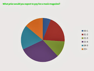
What price would you expect to pay for a music magazine?
£0-1 £1-2 £2-3 £3-4 £4-5 £5+
What type of music magazines are you interested in?
Rock Pop Indie Classical Folk Hip-hop Rap Grime Electronic Jazz Pop-rock Other
What do you buy a magazine for?
Articles Artists Freebies Music downloads Genre Other____________________
What would you want included in a magazine?
Articles Artists Freebies Music downloads Genre Other____________________
What colours attract you most to a magazine?
Red White Black Green Yellow Pink Purple Blue Brown Orange Other____________________
Friday, 18 October 2013
Thursday, 3 October 2013
Before starting my magazine, me and Rebecca went around the school to take several photos. I took photos of classes, the building and the surrounding area. I chose blue and yellow as my theme as it is the same colour as the logo. I used a photo of Rebecca in front of the school entrance on my front cover to show my main headline, I thought the photo was relevant. I used other subtitles to show other stories within the magazine than might be of more interest to students. I have seen this theme throughout other magazines and it looks most appropriate.
I chose to use the same person on the contents as I did for the cover so there is a theme. I stuck to the same colour scheme and used a relevant photo. I made it a simple layout so it was easy to read for the younger years and I decided against adding extra photos so it wouldn't appear cluttered and used a longer border photo instead. I also chose to keep the back ground on the photo rather than cropping it out so it gives the page more of a natural feel.
Subscribe to:
Comments (Atom)


